Project Overview
Forty Winks are a major Australian bedding retailer with 100 stores nationally. Their eCommerce website plays an important role in aiding with decision making and facilitating the purchase journey.
The company realised that to compete effectively within the highly competitive bedding retail market, they needed a modern, customisable and customer focussed platform experience.
This case study focuses on the planning, research, design, testing and optimisation of the initial MVP for their new retail website by a design team of 3, lead by myself.
The Problem
Forty Winks had not significantly updated their website for 4 years and were lagging behind their competitors. They wanted to design, build and launch a new experience within 5 months, in time for their annual AGM conference.
“Competitors aren't necessarily doing it better,
but Forty Winks aren’t where they should be”
– The client
“Competitors aren't necessarily doing it better,
but Forty Winks aren’t where they should be”
– The client
This experience needed to;
• Educate and inspire customers on the product offering
• Optimise the shopping experience to meet user expectations and online sales targets
• Provide an intuitive back-end for quick creation of new campaigns and content
• Improve the post-sales process
• Educate and inspire customers on the product offering
• Optimise the shopping experience to meet user expectations and online sales targets
• Provide an intuitive back-end for quick creation of new campaigns and content
• Improve the post-sales process
Initial research by my team also identified the need to connect the disparate online and in-store experience.
Roles & Responsibilities
With a pressing deadline to meet, a multi-discipline project team was established to tackle the exciting, but mammoth task ahead.
I played a very hands-on role throughout the project, leading the core 3 person design team through planning, research, strategy, ideation and design sprints. I also facilitated stakeholder workshops and weekly progress feedback sessions with the client and development team.
Scope & Constraints
This project would provide some fresh challenges for the team;
• A complex retail project of huge size and scale
• A relatively new and evolving platform
• A blank slate (complete dissatisfaction with the current site)
• No customer research
• Strict timeline and budget
• A complex retail project of huge size and scale
• A relatively new and evolving platform
• A blank slate (complete dissatisfaction with the current site)
• No customer research
• Strict timeline and budget
A phased approach
With thousands of products to cater for, a filterable blog and various custom tools on the wish-list, we knew we couldn’t achieve it all within the timeline. A phased approach was negotiated, with future releases road-mapped as sprints. This allowed us to focus on the minimum viable product (MVP).
With thousands of products to cater for, a filterable blog and various custom tools on the wish-list, we knew we couldn’t achieve it all within the timeline. A phased approach was negotiated, with future releases road-mapped as sprints. This allowed us to focus on the minimum viable product (MVP).
Running out of wall space whilst roadmapping potential feature releases
Design thinking process
I worked with the design team and PM to put together a calendar of activities to meet the brief. We knew we would have to work pretty lean to meet the deadline and agreed to follow the standard design thinking process model to keep things as human-centred as possible.
I worked with the design team and PM to put together a calendar of activities to meet the brief. We knew we would have to work pretty lean to meet the deadline and agreed to follow the standard design thinking process model to keep things as human-centred as possible.
Research & Strategy
Service blueprinting
To help the team get acquainted with the world of bedding retail, I ran a service blueprint workshop with stakeholders, mapping the customer journey from audience triggers through to the in-store experience, delivery and beyond. This helped to align all parties, keep focus on the short term goals, and spearhead a digital roadmap for future opportunities.
To help the team get acquainted with the world of bedding retail, I ran a service blueprint workshop with stakeholders, mapping the customer journey from audience triggers through to the in-store experience, delivery and beyond. This helped to align all parties, keep focus on the short term goals, and spearhead a digital roadmap for future opportunities.
Facilitating a service blueprint workshop.
The evolving blueprint artefact.
User research
Without as much as a marketing persona available, we began a series of lean research exercises, aiming to get a fair understanding of our audience as quickly as possible.
Without as much as a marketing persona available, we began a series of lean research exercises, aiming to get a fair understanding of our audience as quickly as possible.
A selection of research exercises and artefacts.
Provisional user personas
This provided a clearer picture as to who we would be designing for, their needs and behaviours. Insights were grouped by common life stages and documented as provisional (proto) personas to further explore and validate throughout the project.
This provided a clearer picture as to who we would be designing for, their needs and behaviours. Insights were grouped by common life stages and documented as provisional (proto) personas to further explore and validate throughout the project.
Provisional personas, used to guide design decisions.
Customer journey map & visual storyboard
I created visual aids to document the customer journey from awareness through deciding, purchasing and using a bedding product. This helped contextualise how the website and supporting services can be provided to a user through a seamless experience across \all stages of the purchase lifecycle.
I created visual aids to document the customer journey from awareness through deciding, purchasing and using a bedding product. This helped contextualise how the website and supporting services can be provided to a user through a seamless experience across \all stages of the purchase lifecycle.
Mapping a typical customer journey, uncovering gaps and opportunities to inform the website and overall customer experience.
Snippets from storyboards depicting the ideal customer experience for a particular persona.
User Flows
After looking at the wider customer experience, I narrowed back into the MVP and drew up key tasks as screen flows to aid with design.
Sample user flow, showing the golden path for a persona group.
Information Architecture
Sitemap and screen flow
Using the user flows, business requirements, a content audit and SEO recommendations, we were able to determine a high level site map and rough screen flow for the core site architecture.
Using the user flows, business requirements, a content audit and SEO recommendations, we were able to determine a high level site map and rough screen flow for the core site architecture.
Site map and screen flow.
IA validation
As the project progressed, the UX Researcher and I fleshed out the IA further and began testing with various tree jack and card sort exercises. This included the taxonomy for the product filter groups.
As the project progressed, the UX Researcher and I fleshed out the IA further and began testing with various tree jack and card sort exercises. This included the taxonomy for the product filter groups.
Validating the IA through in person and remote card sorts.
Ideating the solution
Feature prioritisation
To decide which areas to focus on first for the wireframes, I ran a feature prioritisation workshop. Feature cards were mapped onto an 'impact vs cost' canvas and then rated by stakeholders. The highest scoring features would be included in the first product release (MVP) and wireframed first.
To decide which areas to focus on first for the wireframes, I ran a feature prioritisation workshop. Feature cards were mapped onto an 'impact vs cost' canvas and then rated by stakeholders. The highest scoring features would be included in the first product release (MVP) and wireframed first.
Feature prioritisation workshop and table snippet.
Concept sketches
We began exploring initial screen concepts through a series of collaborative sketch workshops. As we were working fast and lean, UI components were often inspired by patterns from established ecommerce sites that were successfully meeting similar needs. The aim was to work rapidly and not get attached to ideas too early.
We began exploring initial screen concepts through a series of collaborative sketch workshops. As we were working fast and lean, UI components were often inspired by patterns from established ecommerce sites that were successfully meeting similar needs. The aim was to work rapidly and not get attached to ideas too early.
Sample lo-fi whiteboard sketches of screen elements from various workshops
Wireframes
Research taught us that a large proportion of users start their purchase journey on a mobile device, so I took a mobile first approach. This also helped to keep things simple and efficient for the user when progressively enhanced up to tablet and desktop size.
Research taught us that a large proportion of users start their purchase journey on a mobile device, so I took a mobile first approach. This also helped to keep things simple and efficient for the user when progressively enhanced up to tablet and desktop size.
Early low fidelity mobile wireframes for the home page and menu.
Early concepts were shared for feedback to narrow down the solutions, before being drawn up as wireframes at increasingly higher-fidelity.
A selection of core pages addressing early feedback
Testing the designs
Prototypes
I wanted to collect as much contextual feedback as possible within the limited time. Additional screens and important interactions (e.g. multi-step filtering and complete checkout steps) were included, alongside dummy content for more pointed feedback.
Mobile prototype | Desktop prototype
I wanted to collect as much contextual feedback as possible within the limited time. Additional screens and important interactions (e.g. multi-step filtering and complete checkout steps) were included, alongside dummy content for more pointed feedback.
Mobile prototype | Desktop prototype
Usability testing
We found that time and inconsistent footfall were not on our side for the in-store sessions originally planned. Instead, we setup a makeshift test lab and recruited 5 participants that had no prior knowledge of the project and best fit the personas.
Sample tasks
Loose test scripts were based around typical tasks, with sessions lasting around 30 minutes;
• Finding a store
• Browsing products (discovery)
• Finding a specific product (e.g. bunk beds)
• Making a purchase
Usability testing the mobile site prototype.
Follow-up interview
To complete each session, candidates took a short interview, with focus on the site structure and taxonomy to determine people’s overall understanding of the proposed website architecture.
To complete each session, candidates took a short interview, with focus on the site structure and taxonomy to determine people’s overall understanding of the proposed website architecture.
Test findings
These sessions helped us to validate (and invalidate) some critical assumptions in rapid time, and provided important qualitative feedback to improve the designs.
These sessions helped us to validate (and invalidate) some critical assumptions in rapid time, and provided important qualitative feedback to improve the designs.
"I’d expect specs as a tab with nitty gritty stuff like dimensions."
"I just want to look at price and photos, and that gets in the way."
"Information on specialty stores would be good, more reason to visit stores further away."
– User testing participants
Future tests
Although the prototype was well received, we knew further usability testing would be required with larger sample groups post-launch. This was particularly important for the product filters and search functions, which heavily rely on clean data feeds unavailable at this time.
Hi-fidelity wireframes of the checkout process after feedback.
Applying craft
UI design
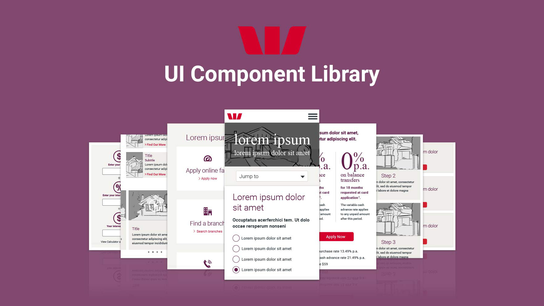
To make the build more efficient, UI elements were crafted in Sketch and synced to Zeplin, creating a live, and easily updatable component library.
To make the build more efficient, UI elements were crafted in Sketch and synced to Zeplin, creating a live, and easily updatable component library.
Visual design of the responsive home, product detail and product listing pages
Iconography & illustrations
During in-store research I observed a lack of way finding and inconsistency with the visual language used both in-store and online causing some confusion in this saturated marketplace.
To meet these needs, our visual designer created a custom visual style which was applied throughout the website. This included illustrating a suite of challenging product features.
Product features are illustrated by visual aids in an own-able style, which will be introduced in-store for visual continuity.
Animated interactions
Important interactions (such as adding an item to your basket) were brought to life through simple animations, offering important user feedback, whilst also bringing an element of delight.
Important interactions (such as adding an item to your basket) were brought to life through simple animations, offering important user feedback, whilst also bringing an element of delight.
Example animatic reference showing how modals could work on mobile.
Outcomes
Fortywinks.com.au launched on time and was well received at their annual National Group Meeting where I helped with he presentation and answered franchisee questions.
Metrics and goals
A 41% increase in online sales from the previous year was recorded within the first 8 months, exceeding our target goal with 4 months to spare. Bounce rate and conversation rate both also saw a noticeable improvements. Average time per session leapt by more than a minute.
A 41% increase in online sales from the previous year was recorded within the first 8 months, exceeding our target goal with 4 months to spare. Bounce rate and conversation rate both also saw a noticeable improvements. Average time per session leapt by more than a minute.
Client feedback
We established a trusted working relationship with the client and will continue to take on customer feedback, adding new features and improvements to the constantly evolving website.
"A very big thank you to the team who have gone above and beyond. I am excited to see where the partnership takes us over the coming years"
– Client email post-launch
By presenting a holistic, research informed customer journey, we helped influence a big change in the organisation. This brings focus to structure and find-ability for their extensive product range, and inspiration through informative content, rather than just bombarding users with cheap deals.
New Learnings
Trust in your team: With a project of this scale you have to learn to let go, I had to set a clear vision and trust my team and be mindful not to hand-hold.
Early stakeholder engagement: In the fast-moving world of retail with multiple stakeholders and targets, I witnessed the importance of early engagement and scope agreement between all stakeholders to avoid scope creep and misinterpretations.
Don’t reinvent the wheel: It would have been foolish to ignore UI patterns from well established, highly successful online retailers. Taking the best from the best and mixing it with our own ideas freed up valuable time for more exploration and testing.
Know your platform: The tech landscape also moves fast, a little platform research into platform features, such as out of the box widgets can be a huge time-saver.
Accept imperfections: Under tight timelines, things were bound to get cut, such as additional, more rigorous user tests. Thankfully post-launch testing is already on the radar.
Cleanse the data: Lastly, I’ve learnt the importance of clean, well managed product data, particularly when it come to site search and product filtering.
.

