Project context
Ronald McDonald House Charities (RMHC) are a global nonprofit organisation who provide a range of support programs, such as accommodation, to families whilst their children are undergoing treatment in hospitals.
Their website plays a crucial role, providing important information on their programs and collecting donations, but was falling short on these objectives.
Their website plays a crucial role, providing important information on their programs and collecting donations, but was falling short on these objectives.
My role
I played a role throughout the project, part hands-on and part team management and oversight;
• liaising with stakeholders to understand issues and gather requirements
• leading the discovery research and strategy
• solution design, creative direction and quality control of delivery
• liaising with stakeholders to understand issues and gather requirements
• leading the discovery research and strategy
• solution design, creative direction and quality control of delivery
Above: Facilitating usability testing sessions
The problem
After years of uncoordinated content creation on an inadequate platform, the website had become a highly frustrating experience for both end users and content creators, with high levels of drop-off, particularly during the donation process.
Our hypothesis was that by restructuring the IA, navigational flow and content hierarchy to meet user needs, we could increase user engagement and task completion, ultimately leading to more donations and better supported families t their time of need.
Above: The current lengthy and confusing donation process
The opportunity
The challenge for myself and my team was to undertake user research with the aim of understanding where the website was failing. We would then explore, test and refine potential solutions to better meet the needs of the users and wider goals of the charity.
Project goals and hypothesis
Make the website more user-friendly;
• Providing clarity on who RMHC are and what they do to increase awareness
• Improving overall UX through quick task-based optimisation to better support time-poor families
• Providing clarity on who RMHC are and what they do to increase awareness
• Improving overall UX through quick task-based optimisation to better support time-poor families
Increase donation conversion by;
• Streamlining the donation process
• Offer more visibility on where donations go
• Streamlining the donation process
• Offer more visibility on where donations go
Allow for better content control by;
• Helping RMHC chapters make their mark on the community through timely content updates
• Reduce the opportunity for duplicate content between chapters
• Helping RMHC chapters make their mark on the community through timely content updates
• Reduce the opportunity for duplicate content between chapters
Above: Reports and support programs formed part of our domain on-boarding
Our approach
With a tight deadline looming and much still to discover about our audience, a phased approach made-up of lean research and design sprints was proposed. This allowed us to quickly gather as many insights and explore as many solutions as possible, whilst keeping the project on track and on budget.
Above: The four project stages, accounting for future measurement and improvement
Discovery phase
For the first phase of the project we undertook a series of lean quantitative and qualitative research exercises to uncover stakeholder requirements, user expectations and usability issues with the current website.
1. Document reviews
to onboard ourselves with the organisation through brochures, data sets and reports.
to onboard ourselves with the organisation through brochures, data sets and reports.
2. Content audit
to list the existing site's content for later assessment and reorganisation.
to list the existing site's content for later assessment and reorganisation.
3. Heuristic evaluation
to get a high-level understanding of the website’s strengths and weaknesses.
to get a high-level understanding of the website’s strengths and weaknesses.
4. Analytics and heat-map analysis
to understand historical browsing behavioural patterns and pain points.
to understand historical browsing behavioural patterns and pain points.
5. Usability testing and screen recordings
to observe how users undertake tasks and identify usability problems.
to observe how users undertake tasks and identify usability problems.
6. User interviews and contextual inquiry
to understand what information was important and when from a variety of contexts.
to understand what information was important and when from a variety of contexts.
7. Ethnographic research
to immerse ourselves within the context of an RMHC support program at a hospital.
to immerse ourselves within the context of an RMHC support program at a hospital.
Above: Outtakes from the research report
Research findings
Throughout this process various usability and content issues were uncovered. In particular; a confusing navigation system, inadequate support program information and duplicate or outdated content.
This lead to an often frustrating and unhelpful experience for people at a time when they are in likely to be highly stressed, short of time and in desperate need of support and guidance.
A wealth of insights were also discovered by speaking to RMHC chapter staff and volunteers, who as primary content generators also needed to be accounted for.
Above: Quotes from user research
Above: Research report summarising findings
Define phase
Through the discovery research, it had become clear that the website provided an invaluable source of information on the support programs and current charity activities to a variety of different users, all with their own needs and circumstances. To improve the experience, we needed to not just consider the interface, but also the find-ability and structure of information.
Proto personas - defining user groups
To help keep focus, insights were distilled into personas for each user group, evolving throughout the project to offer a quick snapshot of behavioural considerations and highlight key tasks with which to accomodate within the solution design.
To help keep focus, insights were distilled into personas for each user group, evolving throughout the project to offer a quick snapshot of behavioural considerations and highlight key tasks with which to accomodate within the solution design.
Above: Sample proto personas
Information architecture - defining the site structure
We realised that over the years more than a thousand pages had been created by the various national chapters, many of which were duplicates or outdated, affecting both SEO and user comprehension.
We realised that over the years more than a thousand pages had been created by the various national chapters, many of which were duplicates or outdated, affecting both SEO and user comprehension.
Working with the head office team and with analytics and other research to guide us, the content inventory was re-mapped, culling redundant pages and forming the basis of a more intuitive IA.
Above: The site map acts as a visual shortcut to the complete information architecture
Navigation - defining content pathways
Optimising the navigation posed one of the greatest challenges. Research highlighted confusion between certain terms and definitions to users unfamiliar with the charity, however these were important for the chapters.
Optimising the navigation posed one of the greatest challenges. Research highlighted confusion between certain terms and definitions to users unfamiliar with the charity, however these were important for the chapters.
Above: Revised primary navigation labels
Through a series of open card sort exercises we were able to observe how users would naturally group and label items. A simple, intuitive taxonomy was then established and retested, greatly increasing the find-ability of topics. To validate the IA further, keyword research was undertaken to show what RMHC related terms people are looking for and in what volumes.
Task flows - defining optimal task pathways
Common user tasks such as making a donation and becoming a volunteer were then analysed to pin-point common pain points. Optimised user flows defined the quickest, and most pain-free way to achieve these tasks, streamlining the process to provide a smooth experience and help increase conversion.
Above: Task flows detailed the optimal path to completion
Concept sketches - defining the interface
With a time-poor audience to cater for, brevity of content become crucial. This became an important consideration as we started to draft potential page layouts, making sure that the content came first, with the interface their to support it. These initial sketched concepts were impression tested with a handful of potential users to collect feedback and make sure we were on the right track, before moving onto the next phase.
Above: Early concept sketches of the home and house accommodation pages
Design phase
Using the wealth of insights gathered, the framework for the new website was illustrated as wireframes, which increased in fidelity as the structure, content and functionality was designed, tested, refined and built.
Mobile first design
To avoid replicating some of the major usability challenges uncovered from testing the current site, all screens were designed for mobile first. This helped to keep core content succinct and accessible across all devices. Additional enhancements were progressively introduced to complement core content on larger devices, such as the chapter listing page which uses the additional desktop real estate to visually display the locations nationally on an interactive map.
To avoid replicating some of the major usability challenges uncovered from testing the current site, all screens were designed for mobile first. This helped to keep core content succinct and accessible across all devices. Additional enhancements were progressively introduced to complement core content on larger devices, such as the chapter listing page which uses the additional desktop real estate to visually display the locations nationally on an interactive map.
Above: Progressive enhancement from mobile to desktop on the House listing page
Information design
Page content was completely restructured into logical groups with information structured to flow like a conversation, quickly answering common user needs.
Page content was completely restructured into logical groups with information structured to flow like a conversation, quickly answering common user needs.
Above: Research insights allowed us to structure content to meet user needs
On program pages, Important details such as House opening hours and contact details were elevated upfront to best anticipate needs. Supporting information, such as facilities, were grouped under mobile friendly tabs, allowing for quick access without burying content.
Above: On long pages, content is divided amongst logical tabs for quick access
Pattern research
For the more complex screens, interaction design patterns were researched and experimented with to maximise the effectiveness of key features. This included the single page donation process, which used an adaptation of the form builder and dynamic donation feedback as popularised by Brad Frost.
For the more complex screens, interaction design patterns were researched and experimented with to maximise the effectiveness of key features. This included the single page donation process, which used an adaptation of the form builder and dynamic donation feedback as popularised by Brad Frost.
Above: The 3 step donation process presents a much less intimidating form than exposing all the fields at once
Design validation
Once complete, the site’s main screens were collected into an interactive prototype for testing. Having close to complete content on core screens helped to provide the right context to users, and allowed for more specific feedback.
Once complete, the site’s main screens were collected into an interactive prototype for testing. Having close to complete content on core screens helped to provide the right context to users, and allowed for more specific feedback.
Above: User testing report documenting the process and results
Above: Mobile wireframes
Component library
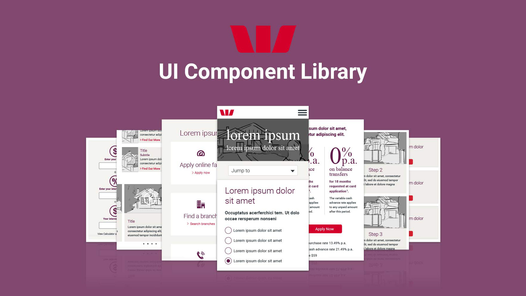
Once validated through testing and approved by stakeholders, screens were broken into UI components and visually designed to meet brand guidelines and accessibility compliance. Collectively, they formed the foundation of the component library, a modular collection of common re-usable elements which make pages easier to build, style and most importantly, learn.
Above: A selection of pages from the component library
Outcome
As a new father recently experiencing the challenges of childhood illness (and the benefits of RMHC), this project was very close to my heart and I am proud to have had the opportunity to contribute to such a worthy cause.
By following a lean process and focusing on meeting the content needs of our users over unnecessary features and functionality, we were able to deliver a complete working prototype consisting of over 50 screens and robust component library within an extremely tight deadline.
The revamped site is currently in the process of being built for an end of year release. I look forward to observing and measuring it’s effectiveness upon and continually improving it’s performance.

