Project Overview
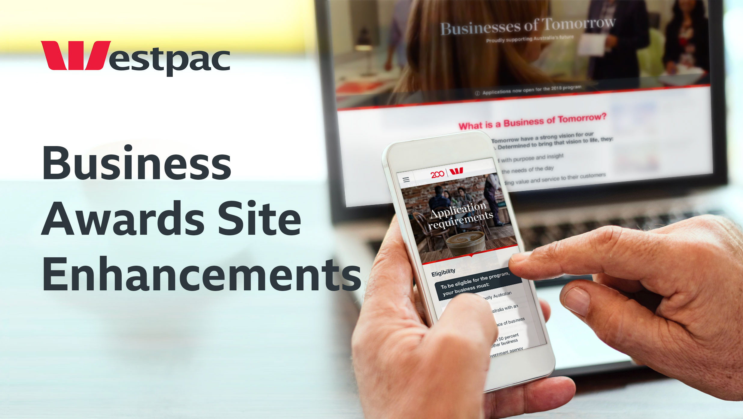
Businesses of Tomorrow (BoT) is an awards program launched by Westpac in 2016 which provides support, resources, mentoring and exposure to Australian businesses.
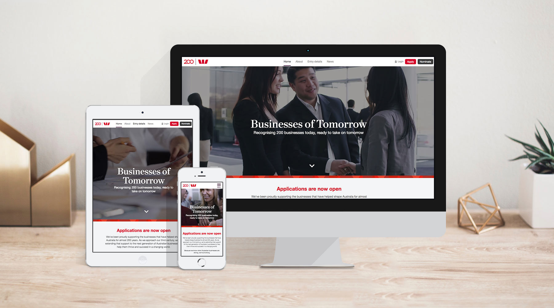
Westpac needed an online hub to house program information and allow businesses to apply securely to the awards program.
This study focuses on the planning, design, testing and optimisation of the responsive website experience over a 2 month period.
“The most important thing going through Westpac right now.”
– The client
– The client
The Problem
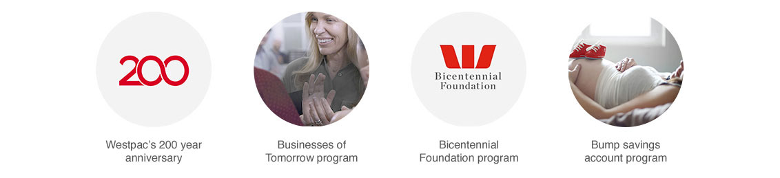
In the lead up to Westpac’s bicentenary, a range of initiatives were launched to help shape Australia’s future.
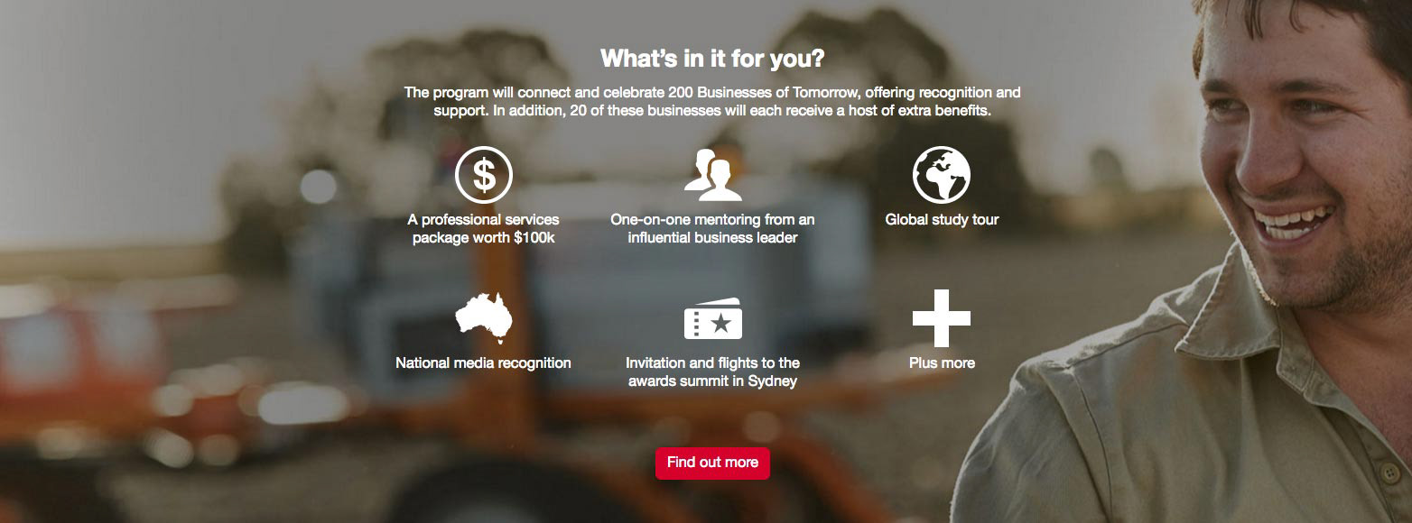
The BoT program was to be one of the first, rewarding 200 forward-thinking businesses with mentoring from prominent business leaders like Ita Buttrose, global study tours to Silicon Valley and China, and generous support packages.
The program required a secure and user-friendly hub to help facilitate online applications. But the bank were unable to create such a bespoke solution through their current AEM platform, and needed a custom design and build within a tight 3-month timeframe.
Users & Audience
Westpac were looking to reach forward-thinking businesses that represented the breadth of Australian sectors, from agriculture to FinTech. Being the first year of the program, only limited user research was available, comprising of documentation from 4 interviews with business founders.
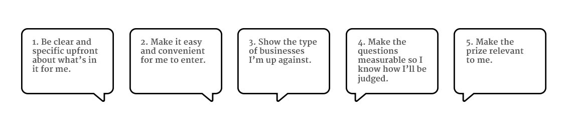
Key findings
Consistent themes emerged from the research that were later backed-up by user testing. These essentially became our ‘jobs to be done’.
Consistent themes emerged from the research that were later backed-up by user testing. These essentially became our ‘jobs to be done’.
"We’re a small business, we work 18 hour days, make it relevant."
– Business co-founder
Despite the lack of time and budget to conduct extensive audience research, the insights proved invaluable in supporting design decisions and keeping the end product user centred.
Roles & Responsibilities
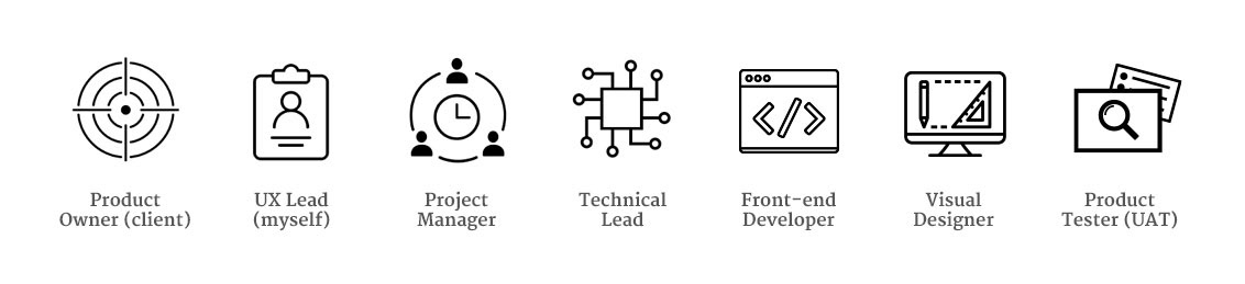
A team made up of agency and client specialists was set up, with core members split between Sydney and Melbourne. As UX Lead, I was responsible for design direction, content strategy, site architecture, sketches, wireframes, prototypes and user testing.
Scope & Constraints
Working with the project manager, a project plan for UX & Design was proposed, which followed a lean, semi-agile framework.
Project planning
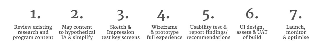
The lean scope allowed the project to sit within the timeline and budget, allowing some flexibility to explore potential solutions.
Working rhythm
To account for the evolving nature of a new, high-profile program, we ran daily stand-ups with the project team and encouraged involvement in workshops and tests. This became vital to the project’s success, creating a shared understanding of the problems, allowing us to work through them together and highlighting risks and unknowns to the client early.
To account for the evolving nature of a new, high-profile program, we ran daily stand-ups with the project team and encouraged involvement in workshops and tests. This became vital to the project’s success, creating a shared understanding of the problems, allowing us to work through them together and highlighting risks and unknowns to the client early.
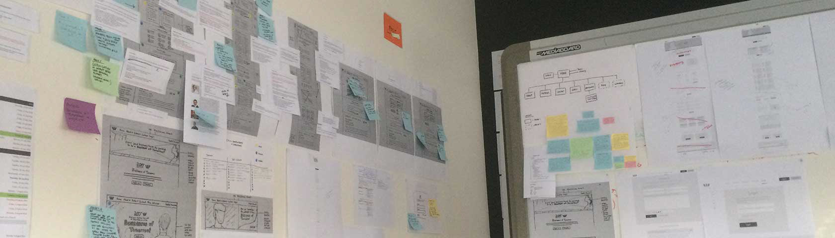
The BoT project room
Information Design & Content Strategy
Content audit and mapping
Initial research highlighted the importance of making the content concise and relevant to the audience. With this in mind, I collected all the current program marketing material and began to redraft key snippets to form the essence of what needed communicating. They were then grouped into a natural site structure to reflect the assumed user flow.
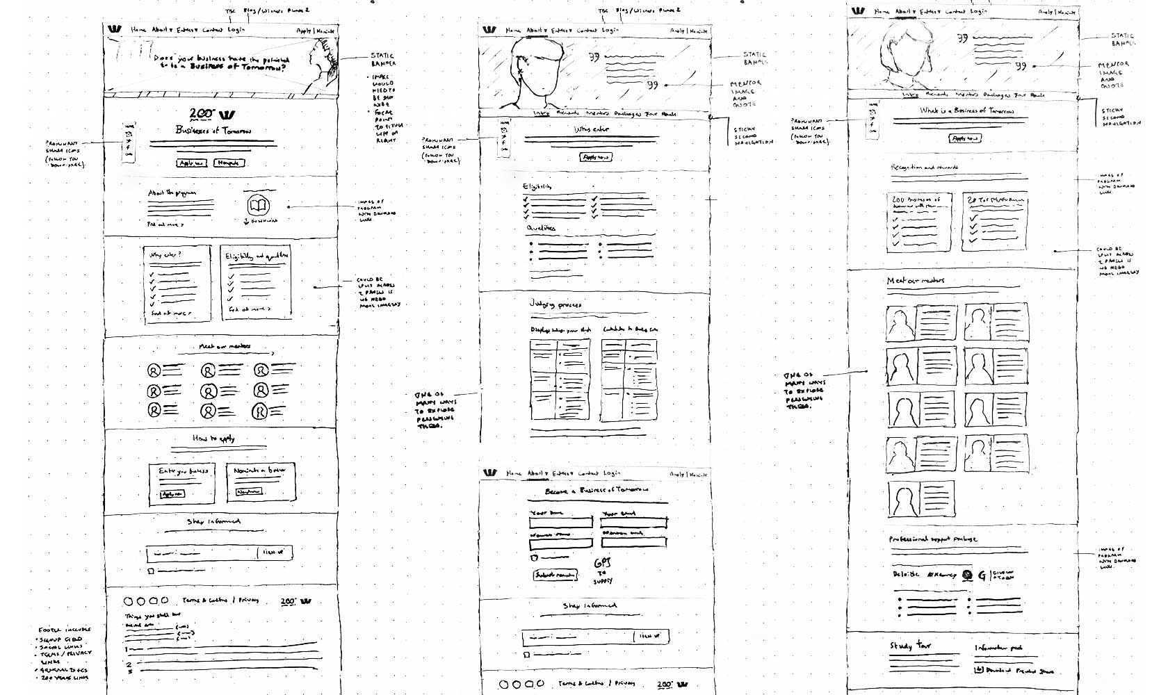
Sketch workshops
Whiteboard sketches proposing what each of the main pages could look like were drawn up. These sketches then were impression tested as paper prototypes for early feedback with business owner contacts of the team.
Initial research highlighted the importance of making the content concise and relevant to the audience. With this in mind, I collected all the current program marketing material and began to redraft key snippets to form the essence of what needed communicating. They were then grouped into a natural site structure to reflect the assumed user flow.
Sketch workshops
Whiteboard sketches proposing what each of the main pages could look like were drawn up. These sketches then were impression tested as paper prototypes for early feedback with business owner contacts of the team.
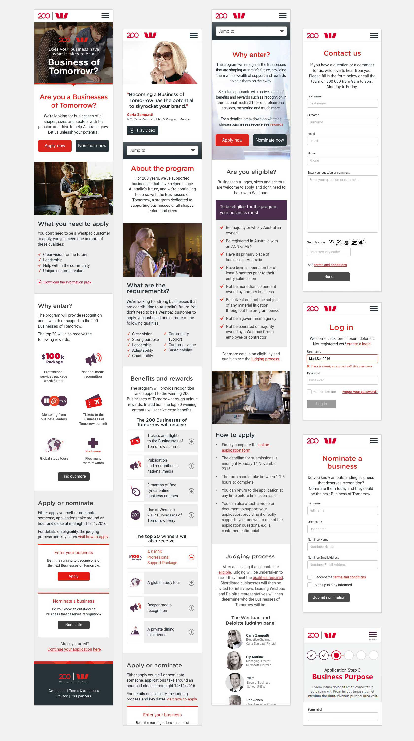
Wireframes
Feedback showed we needed the content in context to really understand the program nuances, and answer immediate questions that may be acting as barriers towards task completion (such as the application process). Detailed wireframes were created for both the mobile and desktop experience, with the rough content snippets threaded in.
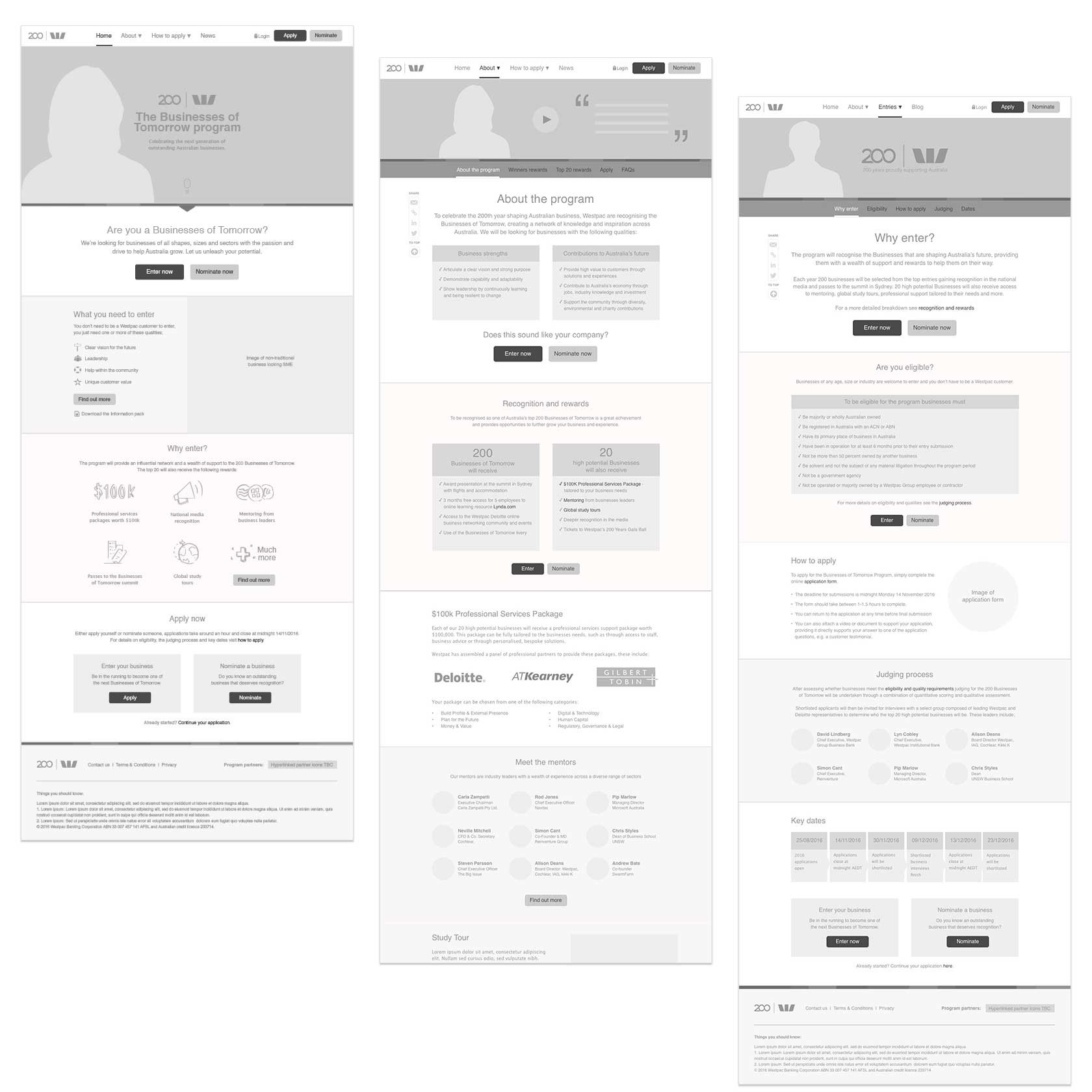
Example mid-fidelity wireframes for the Home, About and Entry details pages.
Prototypes
As the wireframes evolved and collected feedback, hotspots and complex interactions were added to make the interactivity as close to the envisioned experience as possible.
These high fidelity prototypes served multiple purposes;
• acting as the blueprint for development via contextual functional specification,
• collecting and responding to stakeholder feedback and queries,
• allowing for more effective task-based usability tests.
Mobile prototype | Desktop prototype
• acting as the blueprint for development via contextual functional specification,
• collecting and responding to stakeholder feedback and queries,
• allowing for more effective task-based usability tests.
Mobile prototype | Desktop prototype
High-fidelity mobile screens used for user testing
User testing sessions
We came up with three key hypotheses that we wanted to test;
1. Users will understand the purpose of the program and who can enter
2. Users will know who can enter and what criteria is required
3. Users will be able to apply or nominate without any trouble
1. Users will understand the purpose of the program and who can enter
2. Users will know who can enter and what criteria is required
3. Users will be able to apply or nominate without any trouble
Test scripts were prepared based around 5 typical tasks, with each session lasting around 30 minutes.
A group of 7 participants with SME experience were recruited to test the prototype, each of which had no prior use of or knowledge about the website.
The usability tests were carried out in a guerrilla (lean) fashion in a controlled environment that was purposely setup to mimic a typical office.
"Cool, Carla Zampatti, pretty big names."
– User testing participant
– User testing participant
To complete each session, candidates took a short survey to rate their impression of elements of the experience. This created a catalyst for additional feedback and acted as a benchmark for future tests.
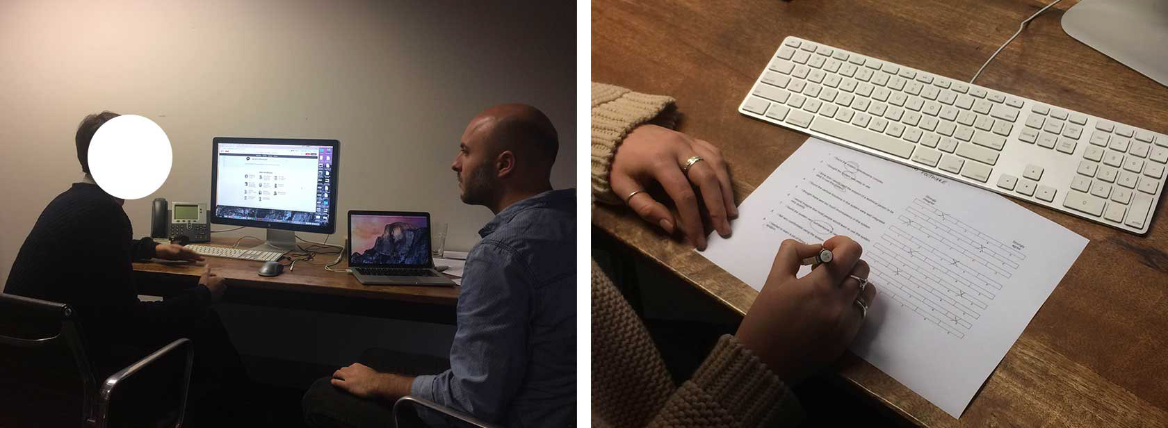
Usability testing the site prototype and exit survey.
Synthesis & Test Report
Different types of insights (such as usability or content issues) were colour coded onto different sticky notes for analysis. These were grouped by common themes and then mapped out onto an impact vs ease of implementation canvas.
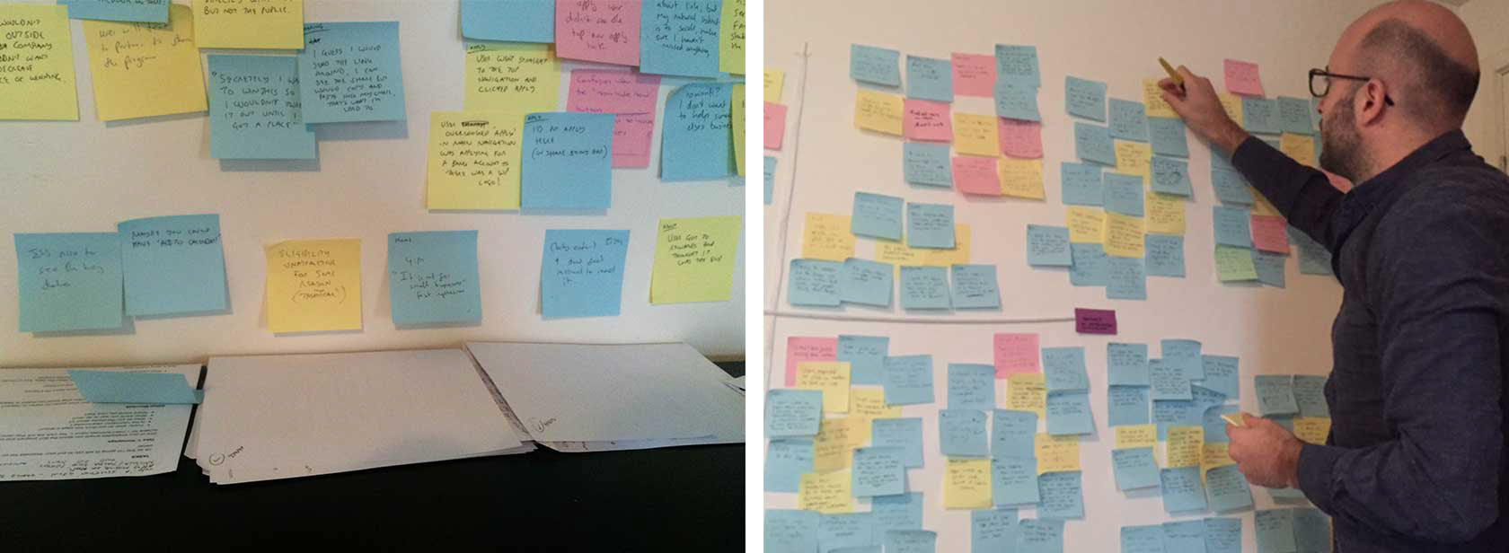
Affinity mapping feedback patterns and building an impact canvas
The test findings were documented into a detailed report outlining common themes (supported by quotes) and recommendations for improvements.
Although there were no major usability issues uncovered with navigation, page structure, or the application process itself - there were still clear pain points with program comprehension. This meant hypothesis 1 and 2 were not validated, however it was clear what was required.
Although there were no major usability issues uncovered with navigation, page structure, or the application process itself - there were still clear pain points with program comprehension. This meant hypothesis 1 and 2 were not validated, however it was clear what was required.
"...simple, easy to navigate, everything is where I expected it to be."
– User testing participant
"a ‘clear vision of tomorrow’ doesn’t mean that much to me."
– User testing participant
– User testing participant
"I don’t want to hear them (the bank) waxing lyrical about themselves."
– User testing participant
– User testing participant
Pre-launch Iterations
The project team and stakeholders soon understood the importance of brevity, structure, trust and clarity with the program, allowing us to cut back superfluous brand messaging and keep the content focussed on the needs of the user. Most recommendations were approved, with content changes going straight into the site CMS prior to launch.
Home page content was simplified and softened, with more clarity on the rewards and fewer 'Apply now' buttons.
Visual design, Videos & Animations
Of course, there is more to creating a positive user experience than structure, flow and written content. To meet the deadline, I mucked-in, helping the visual designer and front-end developers to align the interface to the Westpac GEL standards (Global experience language) as well as storyboarding and creating various assets myself (such as the video masthead).
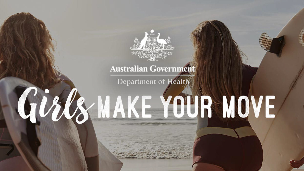
Imagery, video and animations play an important role in bringing the website to life. They enhance forms through simple visual feedback, and encouraging diversity by displaying the different industries, ages, ethnicities and genders that make up Australian business.
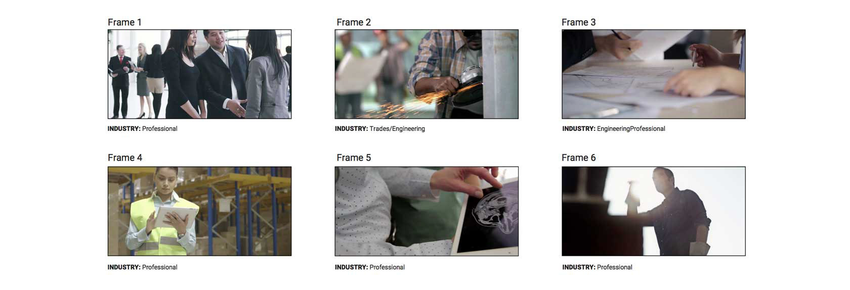
Storyboard: The short, looping masthead video quickly emphasises the desired diversity of industries.
"The video really paints a clear picture of who can enter.”
– Impression testing participant
– Impression testing participant
"I really like the inter-generational images and seeing women at the top."
– Impression testing participant
– Impression testing participant
Outcome
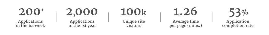
The website launched on time and on budget, attracting nearly 2,000 applications in its first year from 100,000 unique visitors!
The program is seen as a huge success for the bank, exceeding targets and receiving praise from stakeholders and applicants alike around the project approach, outcome and simplicity of the application process.
"It's been such an inspiring program.”
– post-application process survey respondent
– post-application process survey respondent
"unlike other business awards programs, your application process was simple and focussed."
– post-application process survey respondent
– post-application process survey respondent
Coming Soon
The client could truly see the value in a user-centred solution and has since secured a sizeable budget for a more extensive user research study to measure and improve the experience for year 2. Stay tuned to see how the study informed some important optimisations.
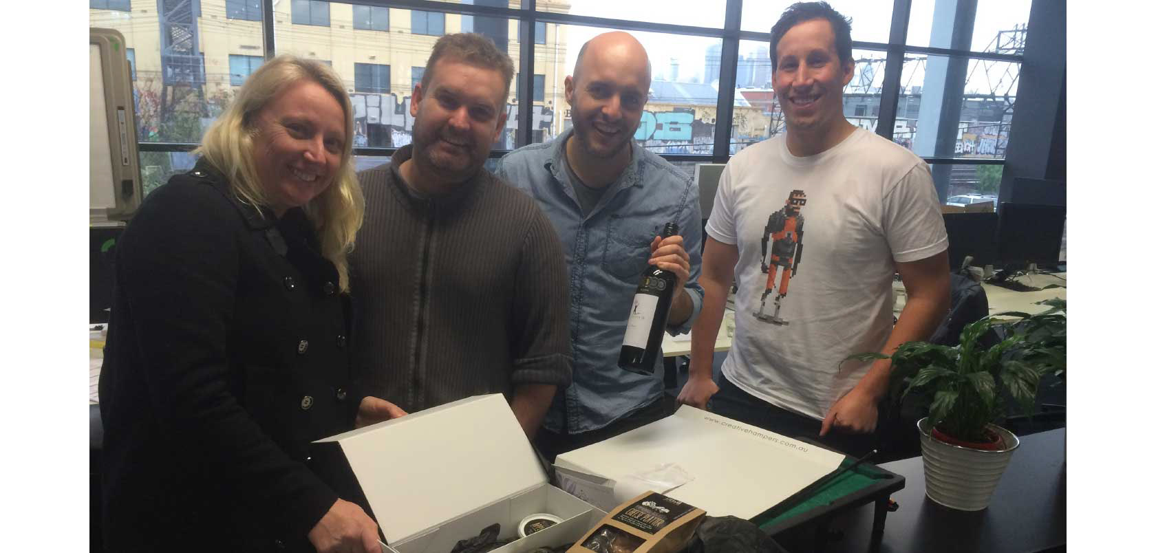
Post launch 'thank yous' and team celebrations
New Learnings
Pragmatism: This project taught me that you can’t do it all and must plan within the constraints. We managed to fit in some valuable pre-launch lean research exercises to guide design decisions, despite the less than ideal timelines.
Co-creation: By bringing the client along for the journey I was able to streamline communication, build trust, alleviate rounds of feedback and influence decision making from a user’s lens.
Content first: Without a dedicated copywriter onboard in the early process, we soon realised dummy copy can only get you so far with testing, and set about creating what we called ‘essence copy’. In future, I will be more persuasive on the necessity of getting content as early as possible.
Direct feedback: Observing user behaviour really grounded us and highlighted the importance of continuous user testing and targeted recruitment. Although quotes help to convince stakeholders, In future I will encourage them to observe tests in person to hear feedback first hand.
Quality tools: Lastly, whilst wading through a tsunami of fallen sticky notes during a long synthesis exercise I realised the implications of buying cheap. It’s extra sticky all the way going forward.
.